People often find themselves unmotivated to cook due to being pressed for time, not having ingredients on hand, and struggling to accommodate their dietary preferences. They need an easier way to find recipes that fit their wants and needs and encourage them to cook.
The Solution
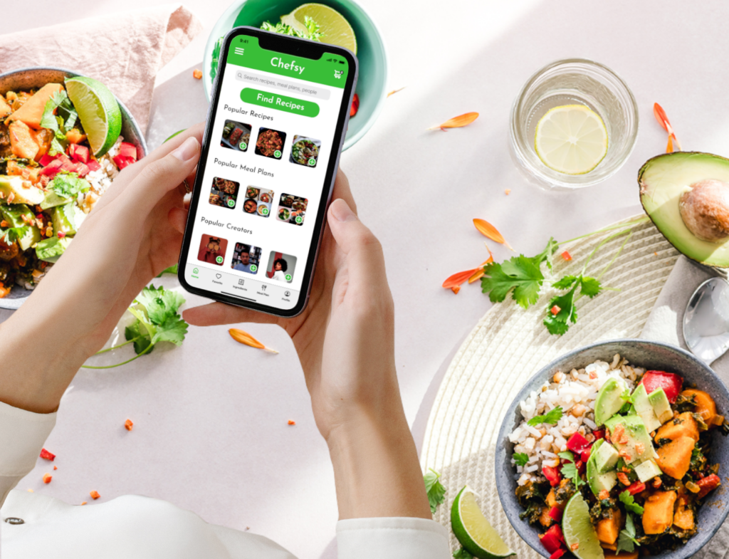
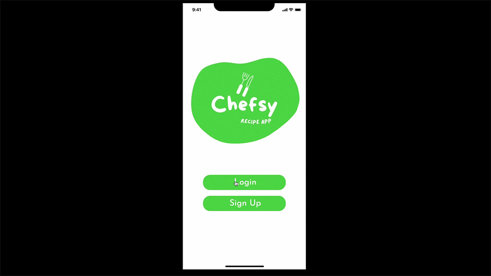
Chefsy is a gamified recipe generation app. The app, gives users recipes based on what they have on hand, letting them create shopping lists to purchase in app, as well as a badge system that incentivizes using the app.
The app seeks to build users’ confidence and motivation to cook, while providing time saving measures.
Duties
I conducted exploratory user interviews and desk research, collaborated on research synthesis and user persona, conducted competitive analyses, created lo-fi and mid-fi wireframes, created prototypes for each stage of design(lo-fi, mid-fi, and high-fi) conducted user testing and made iterations based on findings.
User Research
Proto-Persona
We created two proto-personas to identify a target user. We identified two groups that might benefit from our product: parents and college students.
We figured our users would be conscious of their time, budget, and motivation levels.
Interview Plan
We began by conducting 5 interviews in order to discover how we can make cooking and planning meals easier for people with limited budgets/ingredients. We discovered that there was a higher priority for creating quick recipes, planning, and motivation.
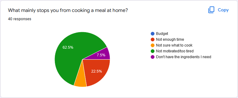
We surveyed 40 participants, ages 18-40+, who on average cooked 4-6 times a week. They felt neutral about cooking and did not meal prep. They are not motivated to cook and their main pain point for cooking was due to time constraints.
Surveying Potential Users
We created a survey that was posted on social media in order to see if there was any overlap in our findings from the user interviews. If so, this would lend credence to the conclusions we draw.
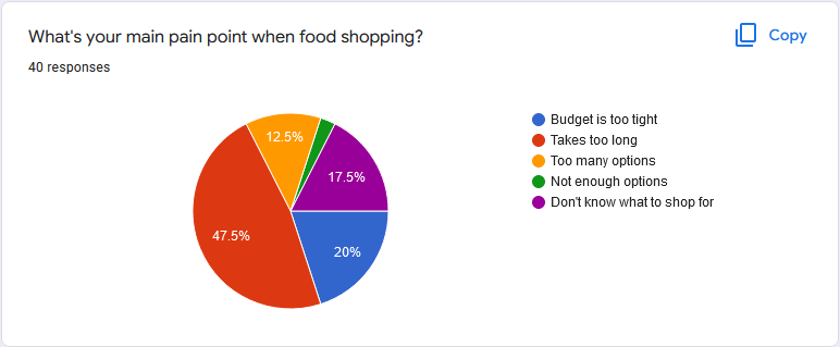
We chose questions that reflected our interview plan, focusing on pain points. We found that a lack of motivation to cook and not enough time to shop for ingredients were the biggest pain points of those surveyed.
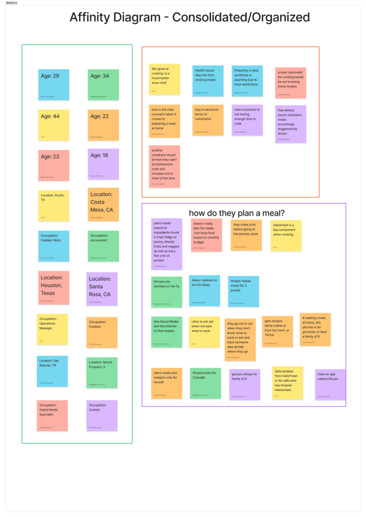
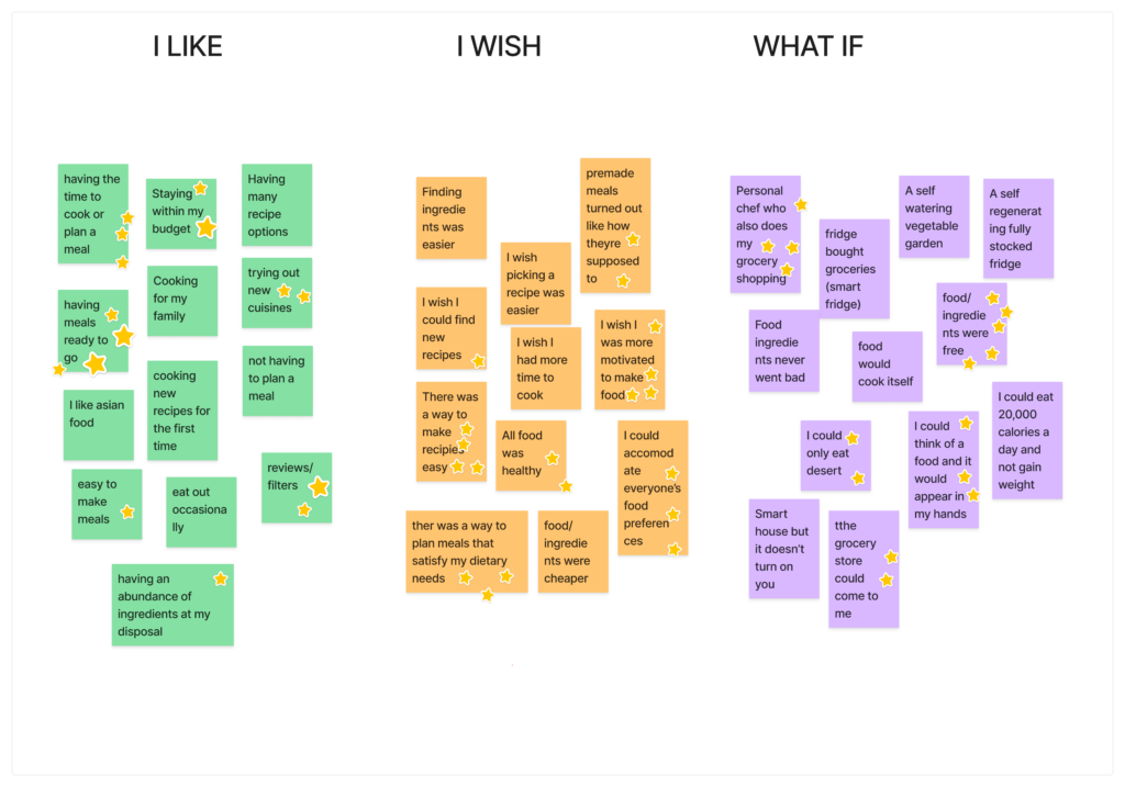
Affinity Diagram
We compiled our interview research into an affinity diagram and grouped our information into 3 different categories based on answers with similar themes. This helped us better pinpoint a potential user by giving insight into what our interviewees found most important and how often users mentioned the same things.
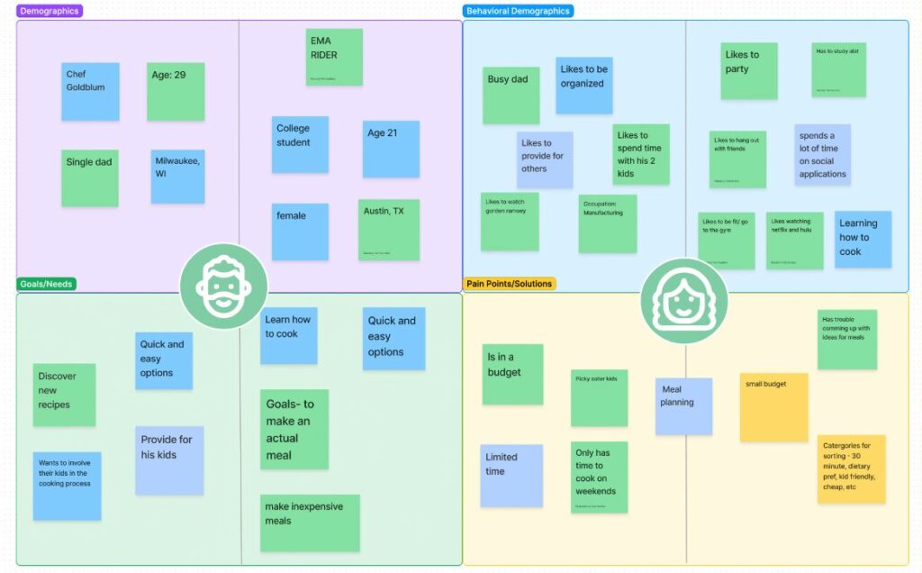
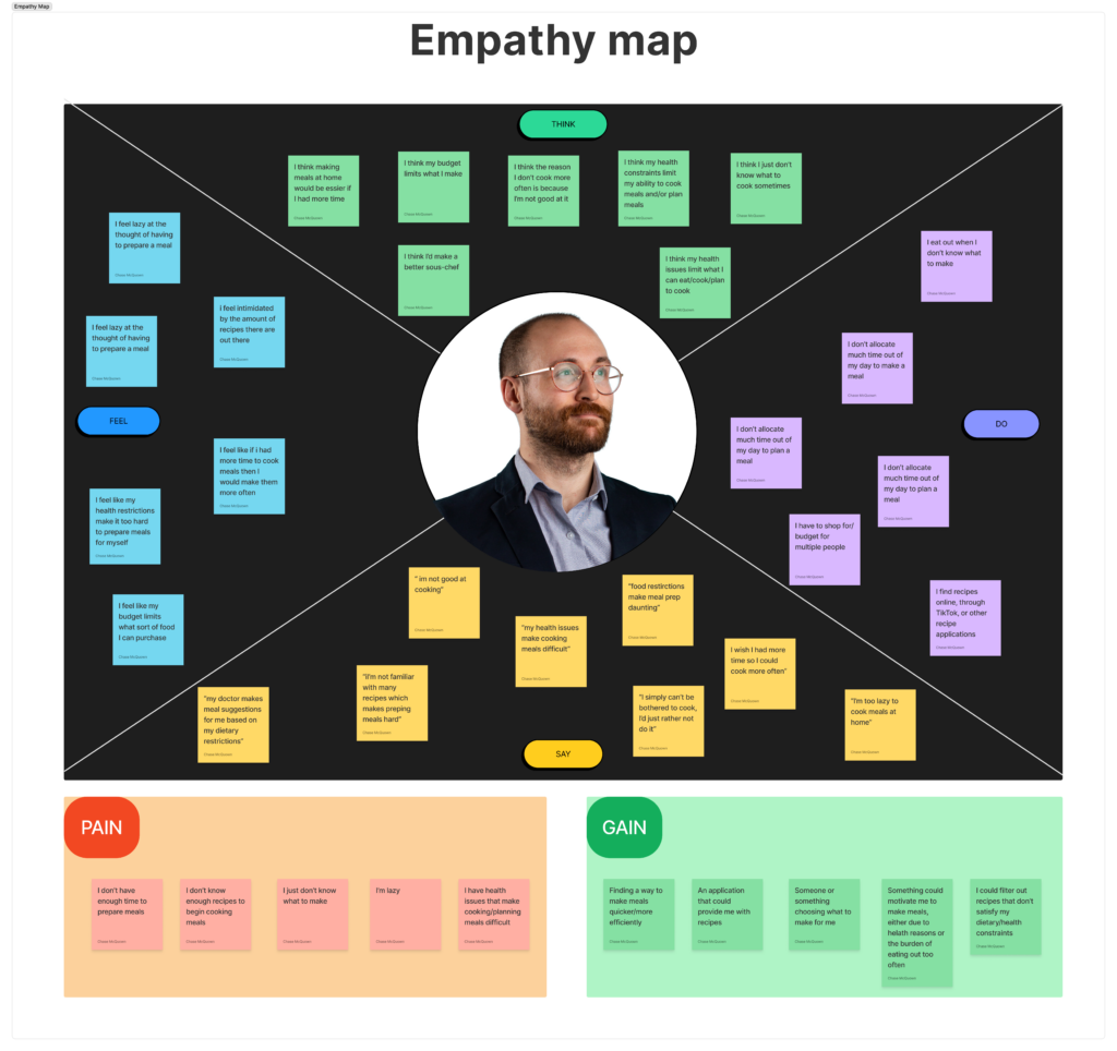
Empathy Map
Using information from our Affinity Diagram and our User Interviews, we created an Empathy Map that reflected what our potential users might be saying, thinking, doing, or feeling.
We also compiled their specific pain points and the potential gains they could receive from our app.
As well, we began to flesh out a potential user, featured in the center of the map.
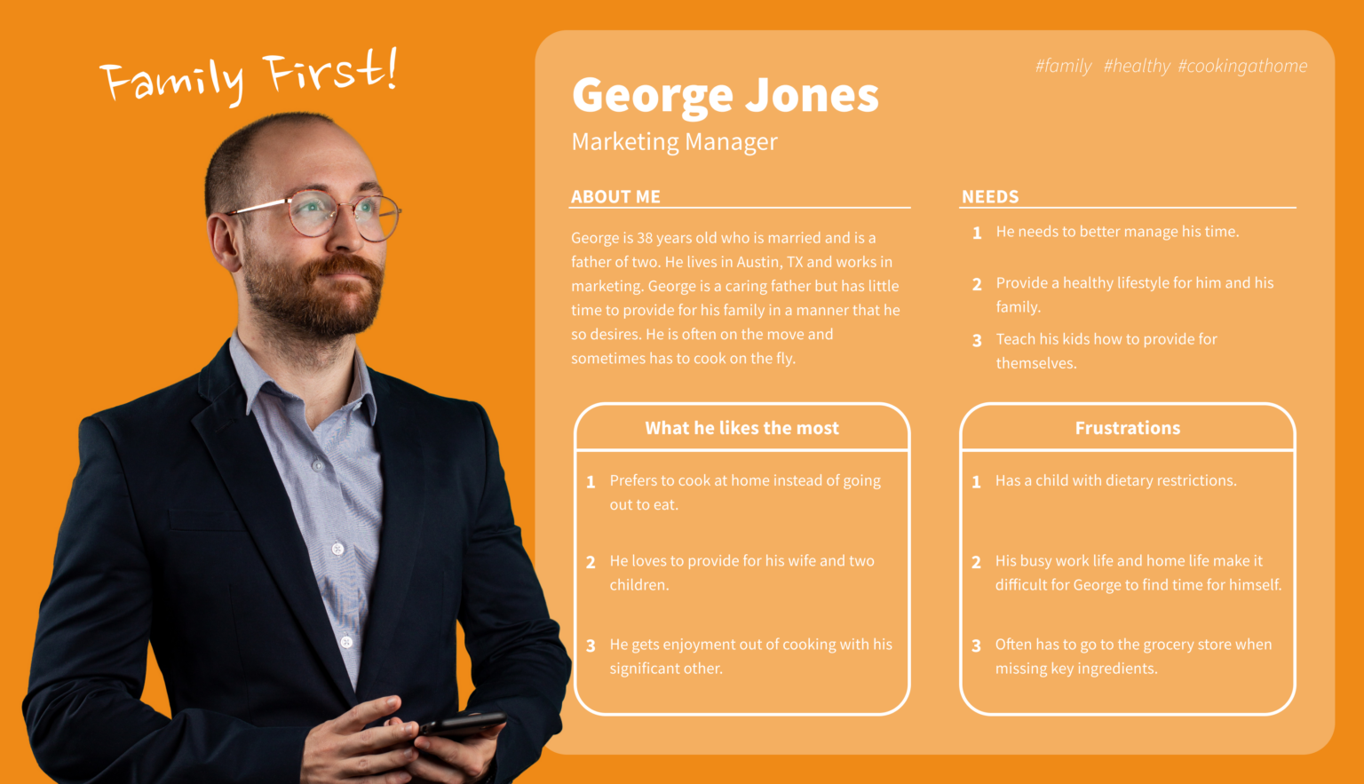
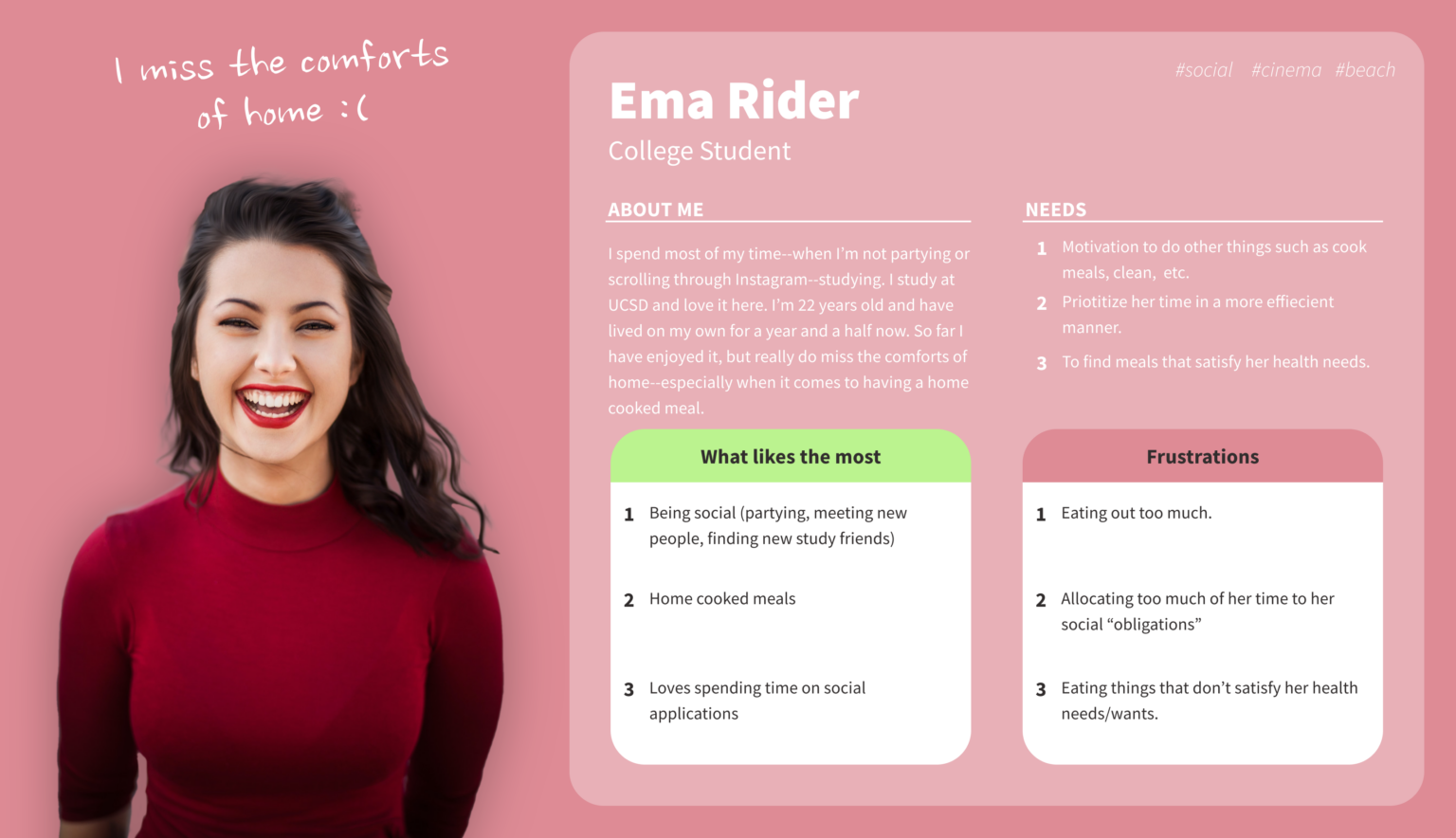
User Personas
Based on the information from our Empathy Map, we created two User Personas: George Jones and Ema Rider.
Definition & Ideation
UX Hypothesis
We believe that users looking for a time management, health-conscious solution for finding recipes and that we might be able to help if we provide a recipe generation app that allows users to customize for their needs.
Problem Statement
People like George and Ema often find themselves unmotivated to cook due to being pressed for time, not having ingredients on hand, and struggling to accommodate their dietary preferences. They need an easier way to find recipes that fit their wants and needs and encourage them to cook.
Our research directed us towards a service that not only saves our users time, but also gives them a wide variety of recipes to choose and is fun to use. Providing an experience that allows for grocery shopping in app, gamifies the recipe finding experience, and keeps recipes and meal plans in one place will allow our users to feel motivated and more confident in building their cooking skills.
Value Proposition
Our solution is to provide a gamified recipe generation app. The app, Chefsy, gives users recipes based on what they have on hand, letting them create shopping lists to purchase in app, as well as a badge system that incentivizes using the app.
The app seeks to build users’ confidence and motivation to cook, while providing time saving measures.
Brainstorming
We empathize with potential users to brainstorm and generate ideas for
design solutions.
Solutions we found most important and relevant to our potential users were voted on, giving us a foundation of ideas to build our app features off of.
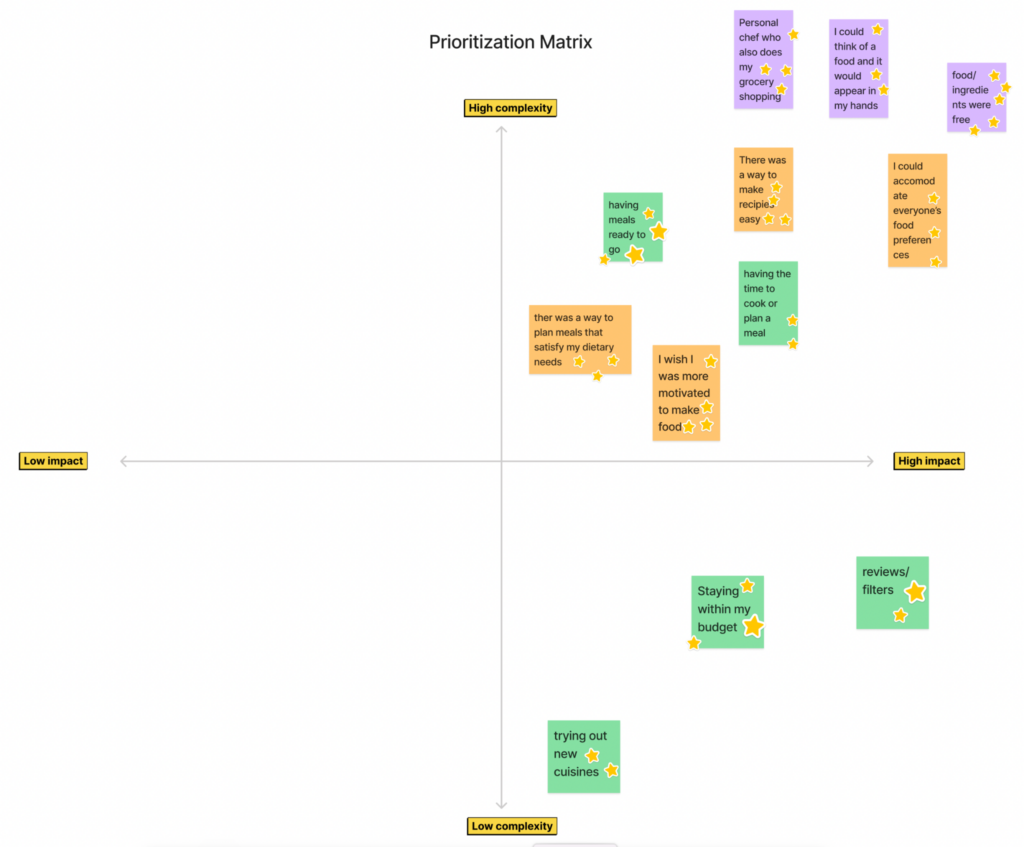
Feature Prioritization
Ideas with the most votes were sorted by relevance and importance then implemented into a prioritization matrix. What features did we want the app to offer?
We found many of our ideas might have a high impact on our users; our focus then was on their complexity. Even the most complex features, however, lended themselves to a usable feature – such as being able to shop for ingredients through the app.
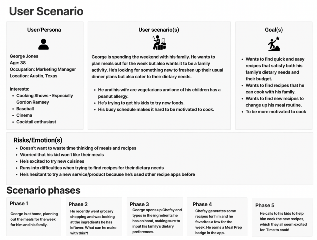
User Scenario
We then put ourselves into the shoes of George Jones, whom we chose to focus on for the remainder of the project. Whilst none of us were parents, our user interviews gave us a great insight into the scenario he might find himself in.
We asked ourselves: What issues might he run into when it comes to cooking? Why is he not motivated to cook? How is his family involved? How does he feel about it all?
From here, we started to blueprint how Chefsy might help him out!
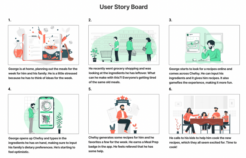
Storyboard
We expanded on our user scenario to create a story showing how George would incorporate Chefsy into his day to day life.
In this scenario, George is feeling stressed about planning meals for the week. He has ingredients on hand but doesn’t know what to do with them. He finds Chefsy and is able to get some great recipes to make with his family.
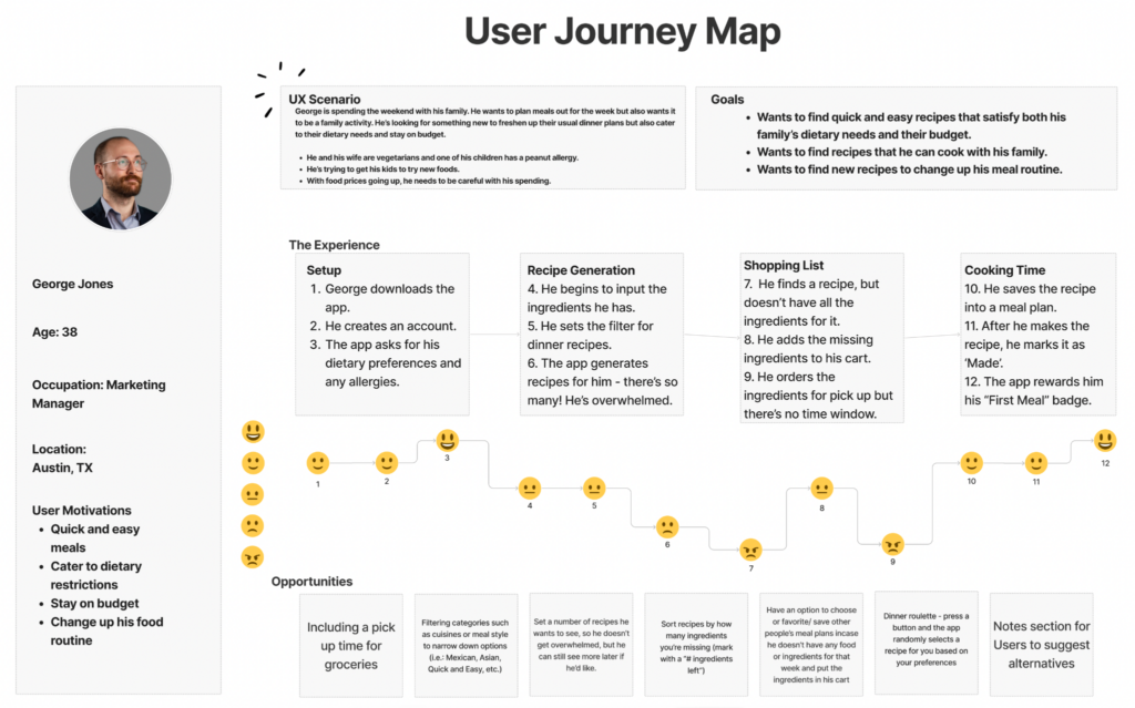
User Journey Map
As we plotted George’s journey through the app, we used that opportunity to think of potential speed bumps for him. These became additional features we could consider building into the app.
For instance, we anticipate George might be overwhelmed by the amount of recipes the app generates for him, which may cause him to lose motivation for cooking and to not use the app. Therefore, we determined to add a more filters to the app to narrow down his options.
Prototyping
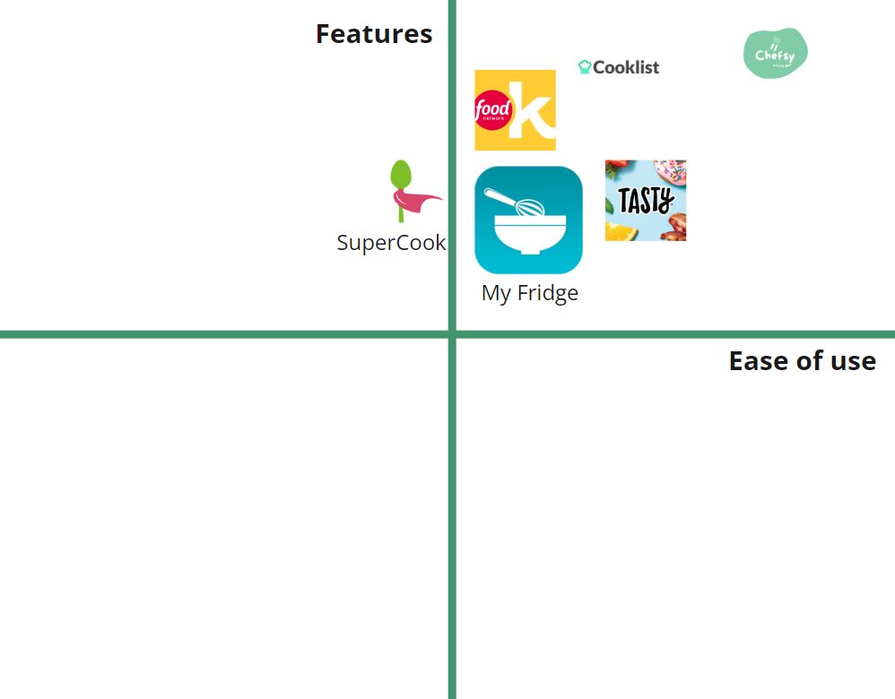
Competitor Analysis
SuperCook: this app had a solid amount of features, but fell short when it came to its design. The main issue this app had was feeling unpolished.
My Fridge: while being easy to use and having a decent amount of features, it felt very boring when it came to its UI and design choices.
Cooklist: this app had an abundance of different useful features, making it Chefsy’s most direct competitor. It could have benefited from larger fonts in certain areas.
Food Network Kitchen: this app was similar to Cooklist when it came to its features. The app didn’t include a recipe generation feature.
Tasty: this app was simple and easy to use and had some useful features. The main issue this app had was pixelated images, which made for an eye sore in certain areas.
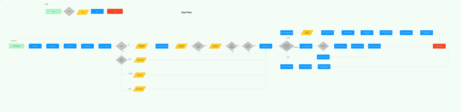
User Flow Chart
Our user flow maps out how the user would interact with the app, from onboarding to the key features offered.
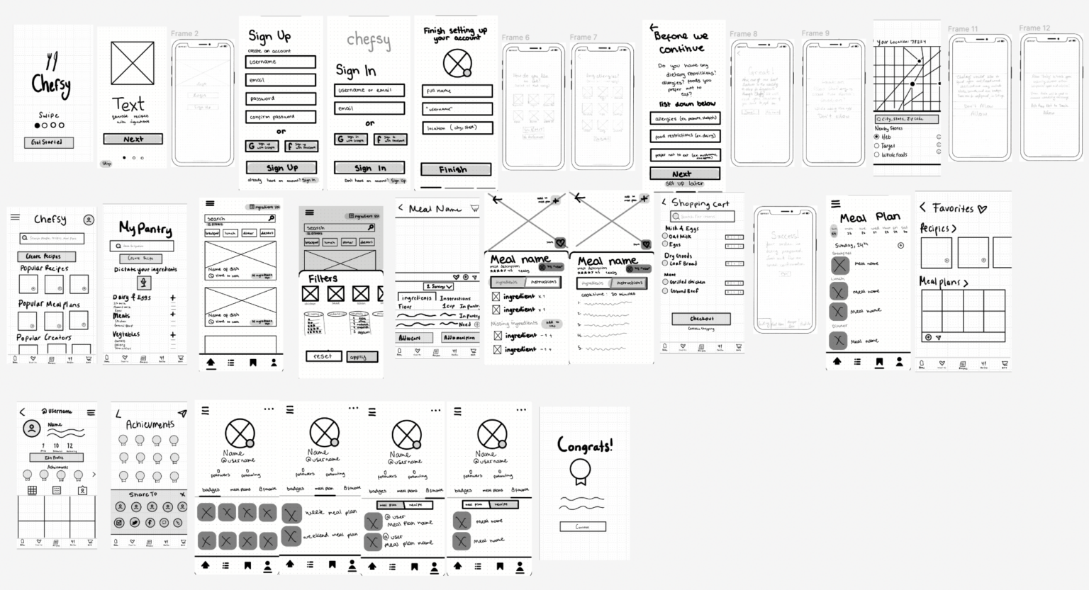
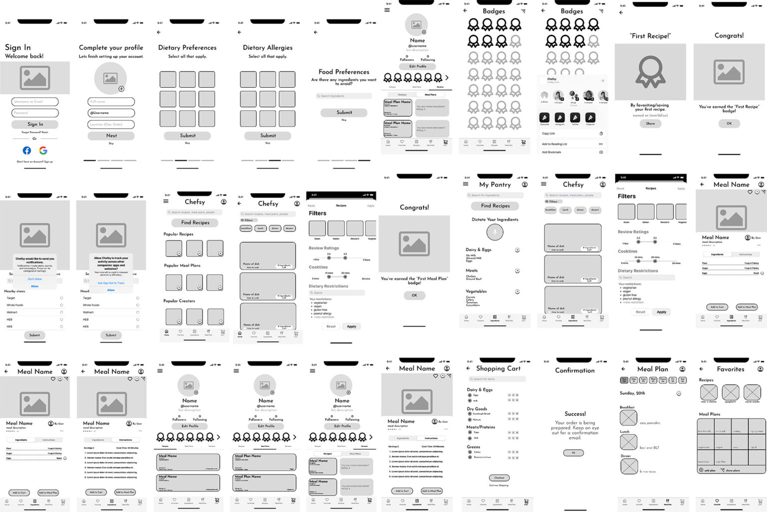
Sketch Wireframes
These wireframes are the intended layout of the product’s UI. Each team member sketched a wireframe of their own and then we chose frames most in line with our vision to create a master wireframe.
Digital Wireframes
Our next step was to create digital wireframes using our sketched wireframes as a reference.
From these, we created a clickable prototype to be tested by users.
Testing & Iterating
Testing Plan
Objective
To identify any usability problems, collect qualitative and quantitative data, and determine the participant’s satisfaction with the product. To make the process of making/ preparing a meal/meal plan easy, efficient and user friendly. To build user confidence.
Target Users
Busy/overwhelmed people that want to cook more and have an organized plan.
Tasks
Users will be asked to complete the onboarding process and test the app’s three key features.
Questions
How easy/hard was it to sign up for Chefsy? To use the key features? To navigate?
What did you like about it? What were some pain points?
Would you use this day to day? Are the badges a helpful motivational tool?
User Testing
Through user testing, we identified usability issues, collected qualitative and quantitative data, and determined the participants’ satisfaction with the product.
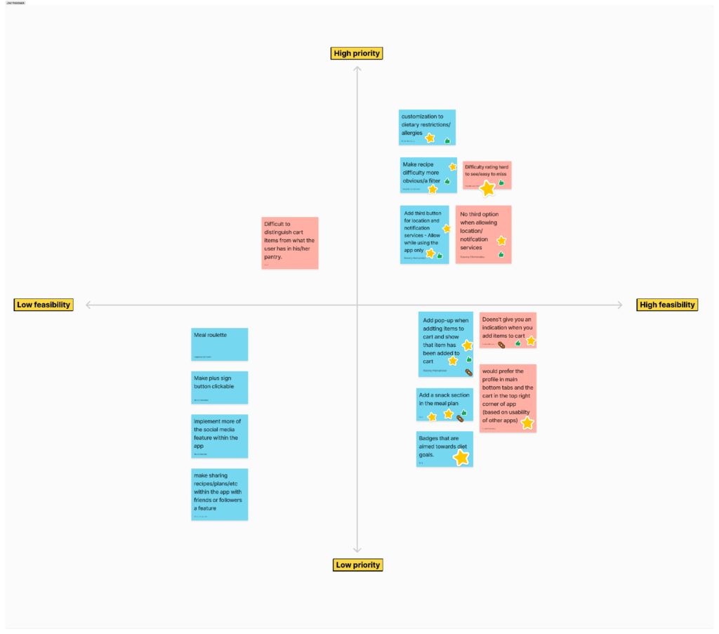
2x2 Feedback Priority Matrix
As a group we gathered all of the feedback we had received from our user tests. With that information we wrote down each observation our users made on sticky notes. We then took turns voting on which sticky note we thought would be important based on feasibility.
With this information we could begin making key iterations to the app.
Iterations
Some of the key iterations we made were:
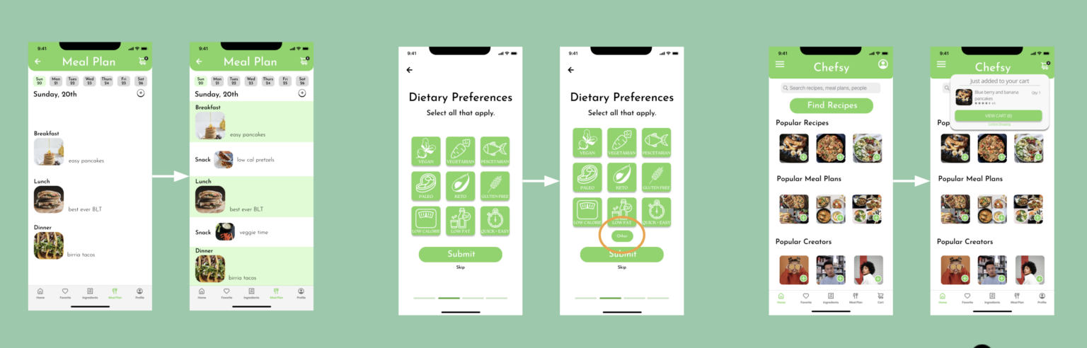
Add a snack section to the meal plan.
Give the user the ability to customize their dietary preference even more.
Make it more evident when items are added to the cart.
Hi-Fi Prototype
Please feel free to click around and explore the prototypes below!
Future Considerations
Add additional social elements to Chefsy, such as a messaging function
Making Chefsy into more of a Recipe Social Network, with a robust community of users helping each other out
Adding a meal roulette feature
Selects a recipe at random (based on your preferences) to keep things fresh