The current website of the Federal Communications Commission is crammed with an overwhelming amount of information, presenting a significant challenge in navigation and usability. Users frequently find themselves lost, struggling to utilize the full range of features efficiently. This complexity not only hinders user experience but also impedes the accessibility of vital communications resources. The need for a strategic redesign is important to transform the website into a user-friendly platform, where information is not only abundant but also easily navigable and functional.
The Solution
To address the navigational and usability challenges of the FCC website, a focused redesign strategy will be implemented. This will include simplifying the information architecture for ease of navigation, enhancing the interface for intuitive user interaction, and ensuring responsiveness across devices. Visual design will be improved for clarity and accessibility. The redesign will prioritize user-centric design principles, with ongoing user testing and feedback integration to continually refine the user experience.
Duties
As a solo project, I completed each step of the process from end to end. I conducted user research, UI analysis including heuristic evaluation, annotations, color accessibility analysis, and audits. I conducted competitive analysis, user testing, and made iterations based on findings. I created wireframes and prototypes for each stage of the design.
U/I Analysis & Usability
Proto-Persona
Demographics: 47, plumber, Santa Ana CA, GED, married
Bio: Tim is a plumber from Santa Ana, CA. He has a wife and two kids. He enjoys watching NHL hockey, NFL football, and other sports with his two sons in his free time. One of his sons is autistic and suffers from sensory sensitivity.
Interests: fishing, camping, working on truck, watching sports on TV
Influences: wife, kids, job, clients
Goals: spend time with sons, buy a new truck, pay for sons college
Motivations: wife and sons
Pain points: avoiding potential auditory distressors to ensure his son is comfortable
Why would Tim visit the FCC website?
As previously mentioned, one of Tim’s sons is autistic. His son struggles with sensory sensitivity and one of his main triggers is loud noises.
Some of the commercials that play during the intermissions of the NFL games that Tim has been watching seem abnormally loud–or boosted for that matter (which is illegal under FCC guidelines). As a result, Tim’s son becomes very uncomfortable during these commercials.
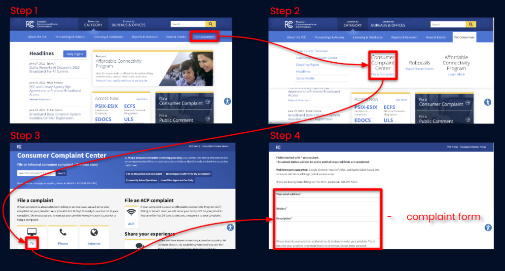
Tim has decided that the best option for his son’s well being is to visit the FCC website in order to file a complaint.
How does Tim resolve his issue?
Tim begins his journey by visiting the FCC homepage. He isn’t quite sure what the FCC is or what it does. He was referred to their website after telling a coworker about his concerns for his son’s well being. He struggles initially with where to navigate in order to file a complaint. He eventually finds the “For Consumers” tab and hovers over it. Upon hover, he finds a nav element labeled “Consumer Complaint Center” and clicks on it. Prior to this event, he is taken to the consumer complaints page.He finds a card labeled “TV” and clicks on it (though he wishes this card were more interactive so that it was obvious that this was the element he was hovering on). Finally, he ends up on a page where he can fill out a form describing his issue.
Wireflow
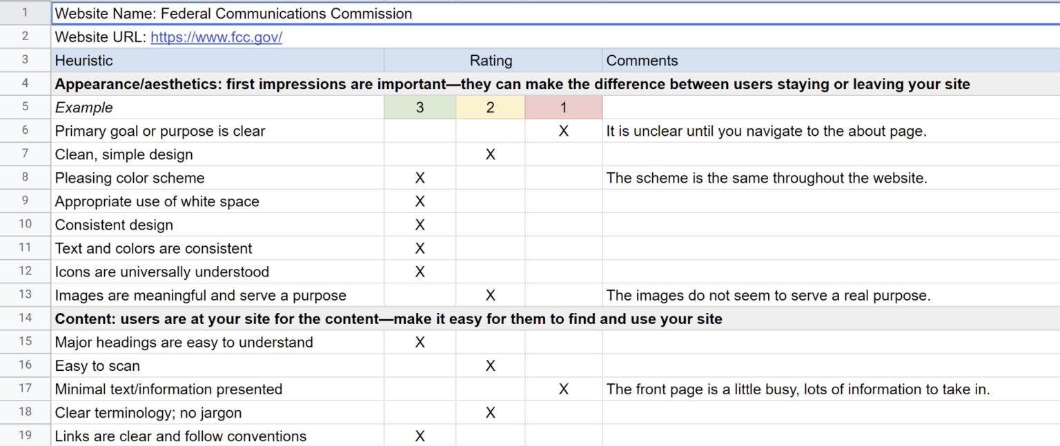
Heuristics Evaluation
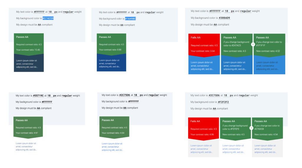
Color Accessibility
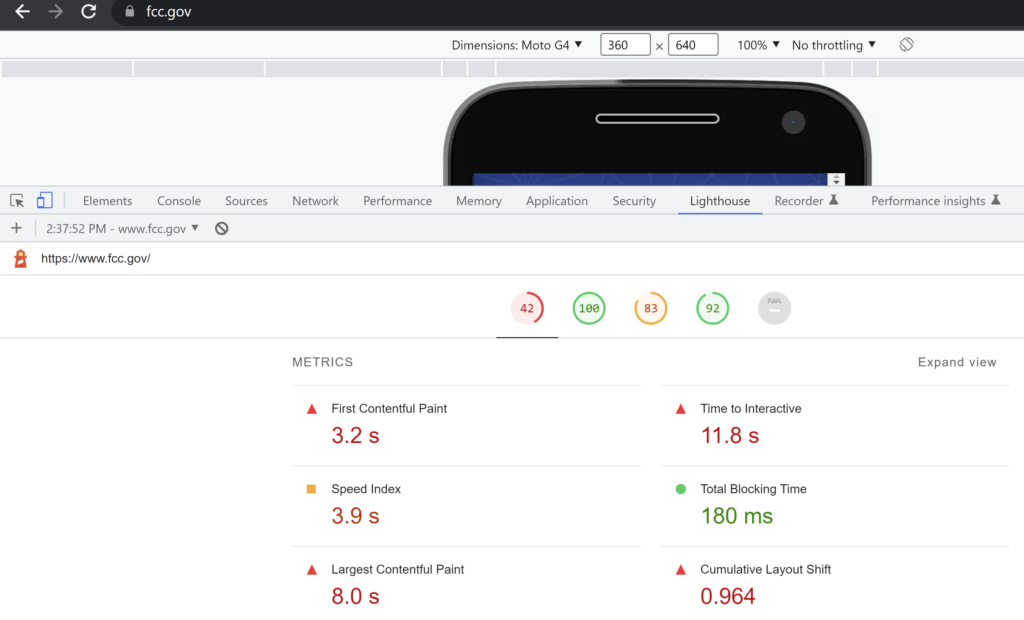
Google Lighthouse Audit
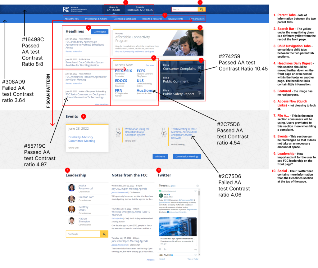
Annotations
Positives
Consistent theme
Easy to recover from errors when filing a complaint
Negatives
Difficult to understand what the FCC does
Information overload
Poor button placement
Utilization of space is inefficient
Difficult to scan some pages
Some areas have poor color accessibility
Research Plan
Research Question: How can we streamline the process of filing complaints on FCC.gov?
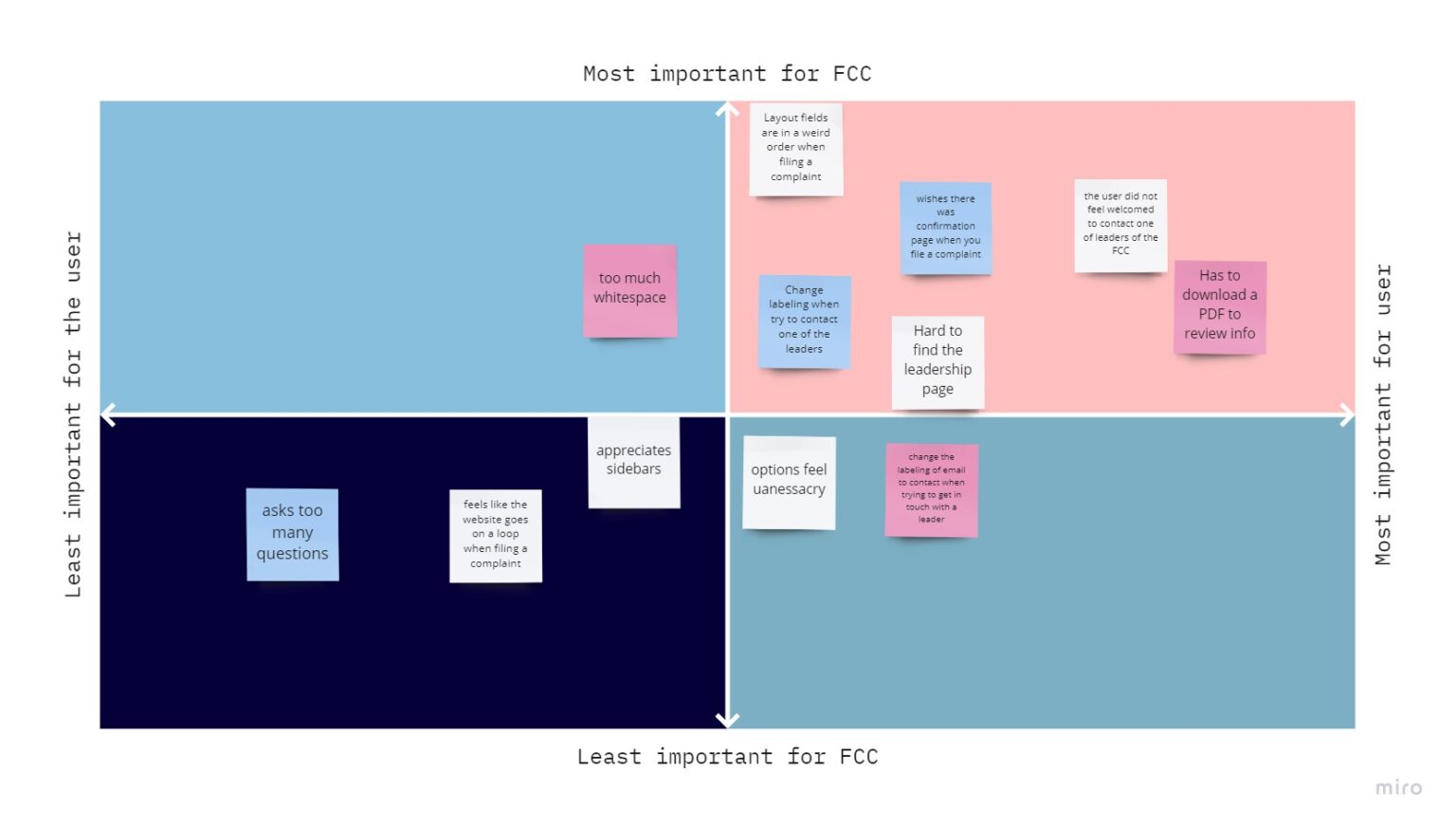
Objective 1: Find pain points people have when navigating the FCC website.
Objective 2: Gain understanding of why someone would go to the FCC website to file a complaint.
Objective 3: Find out what changes users would make to the FCC website in order to make the complaint filing process smoother and/or more appealing.
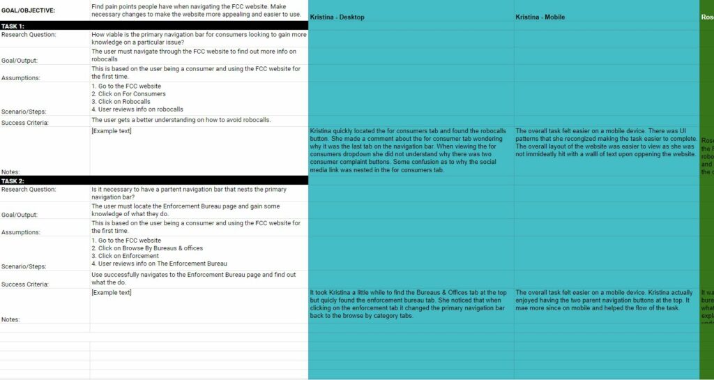
Current Site Usability Testing
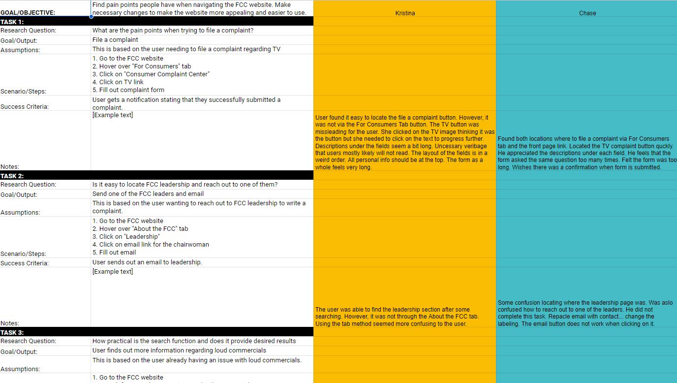
Usability testing was conducted to assess the effectiveness and user-friendliness of the current website. In these tests, participants were tasked with completing three activities designed to mimic typical user interactions. Their performance was evaluated based on success rates, highlighting the nature of the site’s design and navigation. Each testing session was recorded, providing a visual and auditory record of the user experience. Detailed notes were taken, documenting feedback areas such as specific pain points encountered, the overall conciseness and clarity of the website’s content and direct comments made by users.
Results
Information Architecture
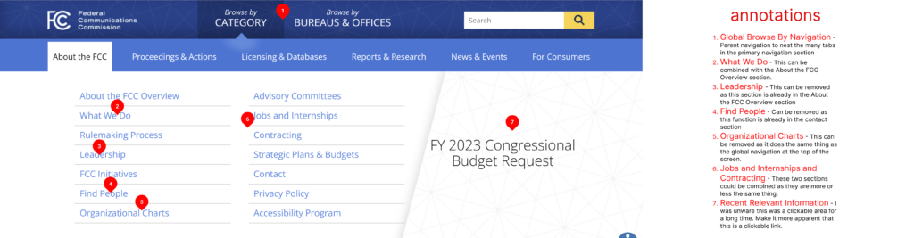
Current FCC Navigation Analysis
What’s working
Clear and easy to read
What’s NOT working
<a> tags of sub nav elements don’t change state while hovering
Poor utilization of LATCH principles
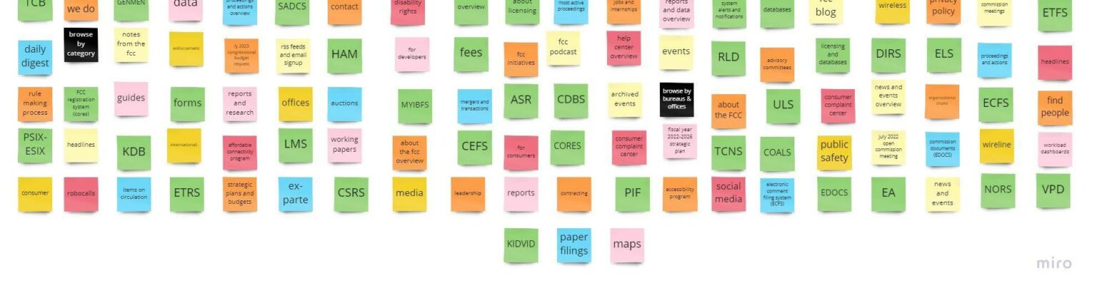
Card Sorting
What needs to be changed and why:
Each tab has an overview link of itself. This link can be removed as each tab already takes the user to this specific link when clicking on the tab button itself. Also, the links below the overview link contains all the information already.
A lot of links can be relocated or even removed due to it either containing outdated or useless information. All the cryptic abbreviations under the Licensing & Databases tab can be removed. This information is confusing for the user and can be found in another link.
Some links can be combined as they contain similar information.
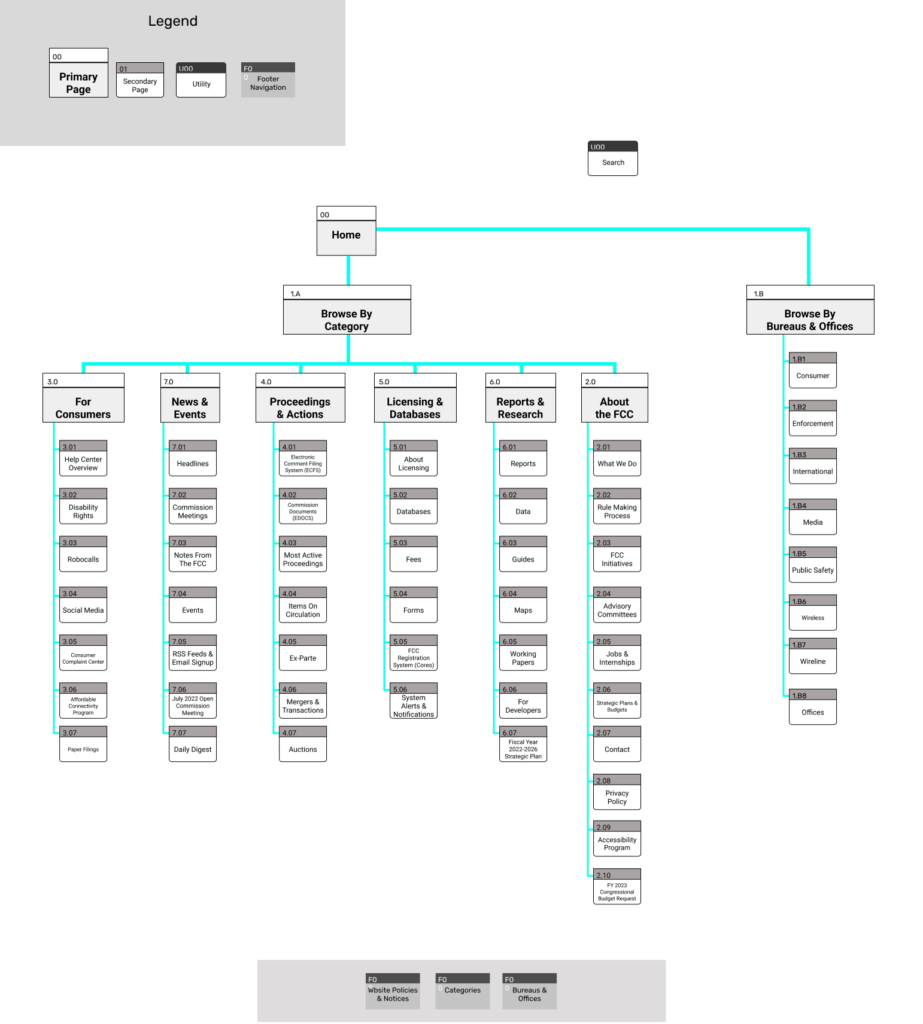
Sitemap Redesign
The Goal:
Put the consumer first
Reduce clutter
Do away with useless information
Be consistent and concise
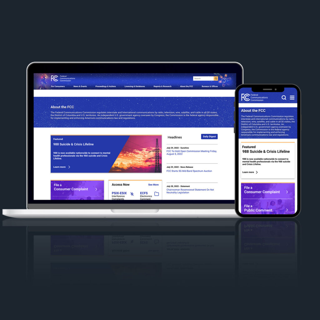
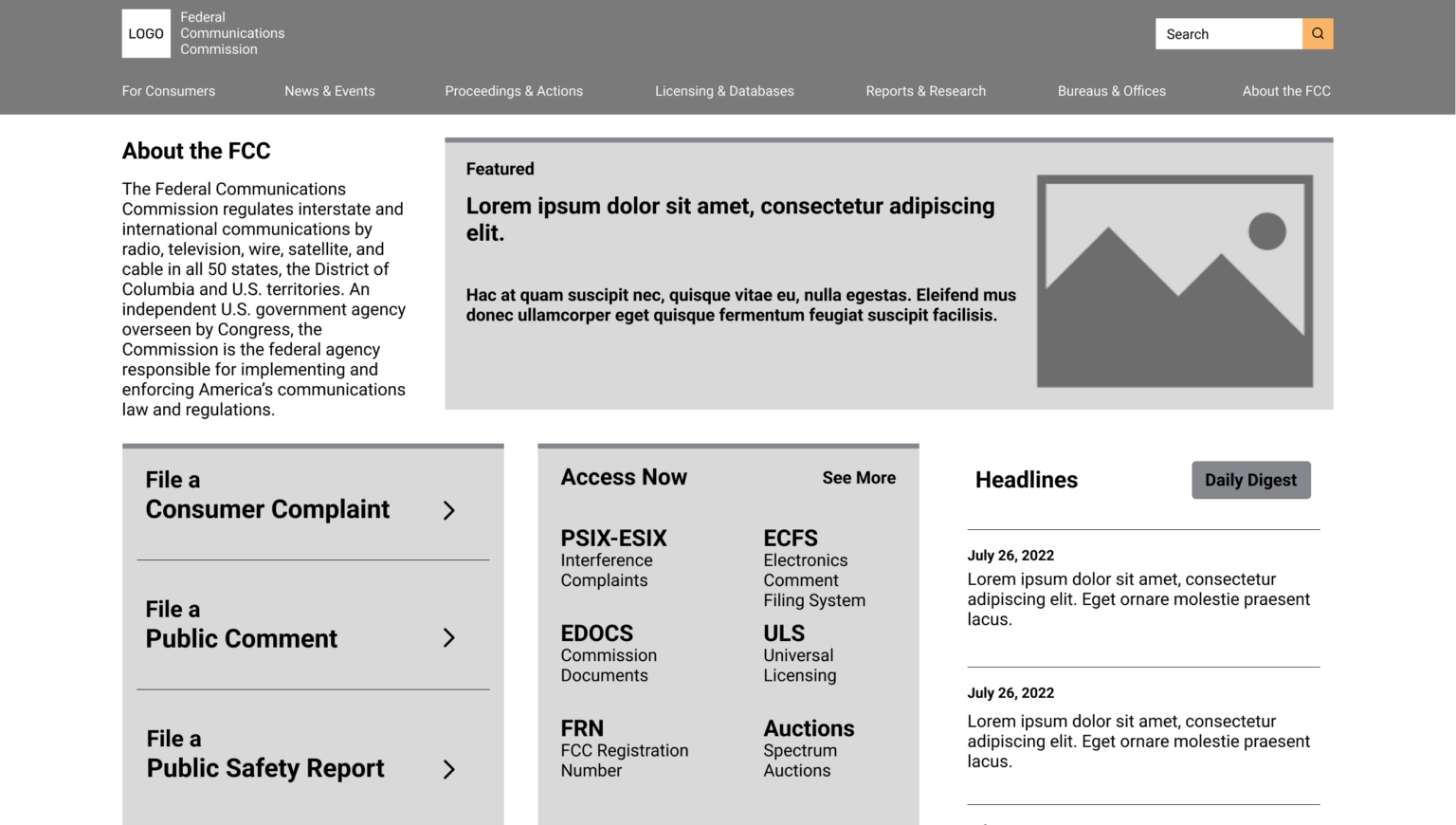
Homepage UI Design & Testing
Lo-Fi Clickable Prototype
A low-fidelity prototype was created to validate the structural logic of the redesign. This early-stage was planned to ensure that the foundational aspects of the design were intuitive and straightforward before advancing to the development of a higher-fidelity, more intricate product. This approach aimed to solidify the core design principles early in the design process, thus facilitating a smoother development phase and ensuring a user-centric final product.
UI Style Guide
I shifted focus to developing a style guide. The aim was to create a visually appealing design that not only catches the eye but also ensures proper contrast and hierarchy among the UI elements. This approach was designed to not only enhance the aesthetic appeal of the prototype but also to bolster its usability and user experience.
Mid-Fi
Hi-Fi
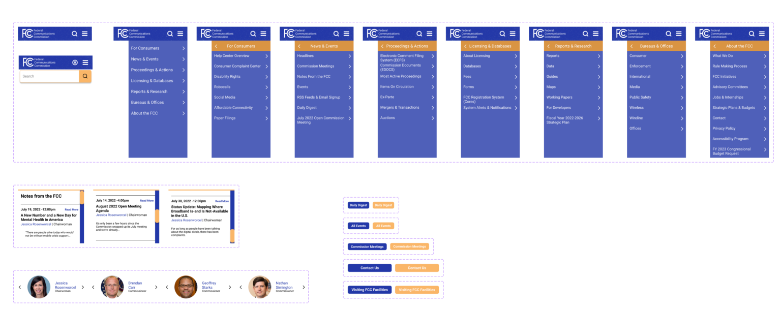
Nav Component Iterations
I transitioned from the low-fidelity design phase to a more refined, mid-fidelity stage. Concentrating my efforts on the refinement of the website’s navigation components to enhance user experience and interface fluidity.
Desktop Nav Component Iterations
Mobile Nav Component Iterations
Usability Tests
Five user tests were conducted using a high-fidelity prototype. The primary aim of these tests was to validate the design direction, ensuring that each iteration of the site not only met user expectations for a more engaging and efficient experience.
Throughout this process, I actively engaged in detailed note-taking and feedback collection from participants. This input is to guide in future iterations, allowing for a more targeted and impactful refinement of the site.
Prototypes
Please feel free to click around and explore the prototypes below!