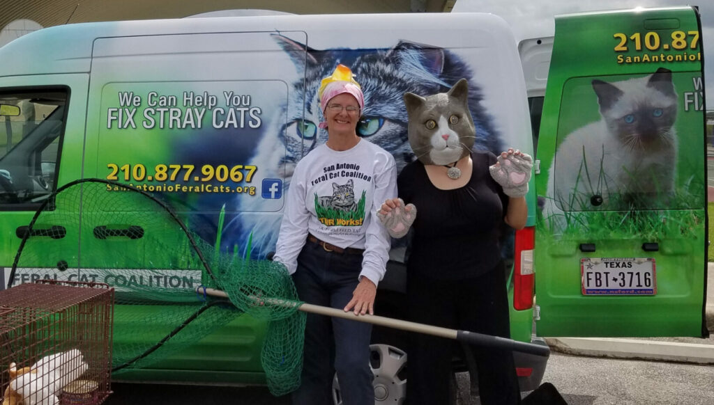
The San Antonio Feral Cat Coalition is an American non-profit organization that addresses issues related to feral cats in the San Antonio area.
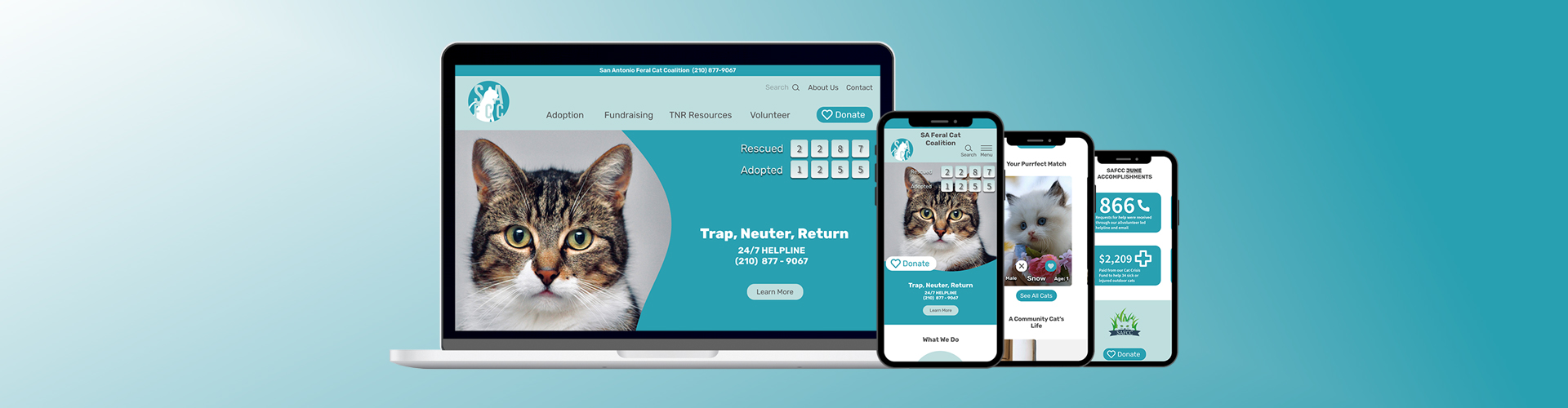
The goal of the project was to redesign the organization’s website for both desktop and mobile in aims to make it more accessible for young and old users alike.
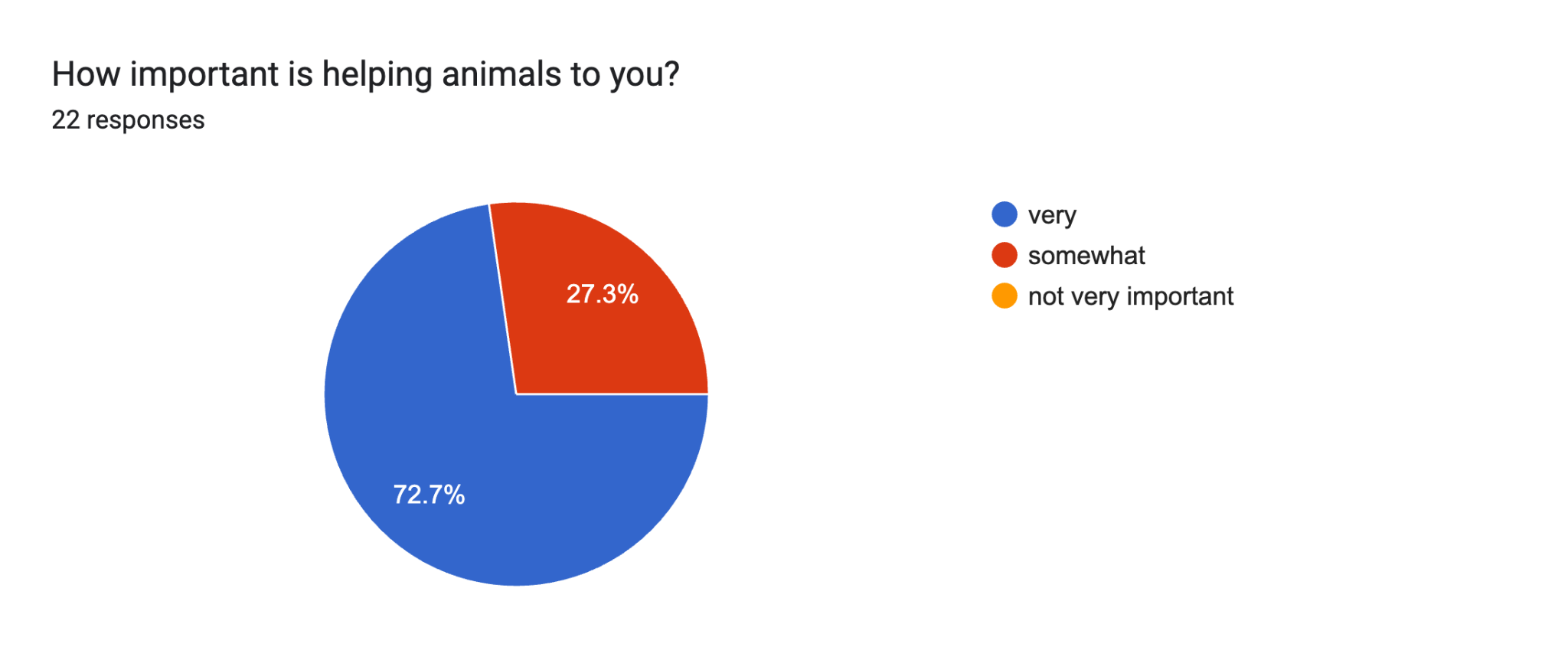
Users want easy ways to navigate a website and have flexible ways to volunteer, adopt, and donate, so they can be more involved in their community and contribute to a cause they feel passionate about.
The Solution
A website that provides individuals with quick access to information about feral cats, volunteering, adopting, donating, and creating a user interface that is user-friendly, simple, and enticing to use.
Duties
I conducted exploratory user interviews and desk research, collaborated on research synthesis and user persona, conducted competitive analyses, created lo-fi and mid-fi wireframes, created prototypes for each stage of design(lo-fi, mid-fi, and high-fi), conducted user testing and made iterations based on findings. Participated in case study presentation to stakeholders and demonstrated high-fidelity prototypes.
User Research &
UI Analysis
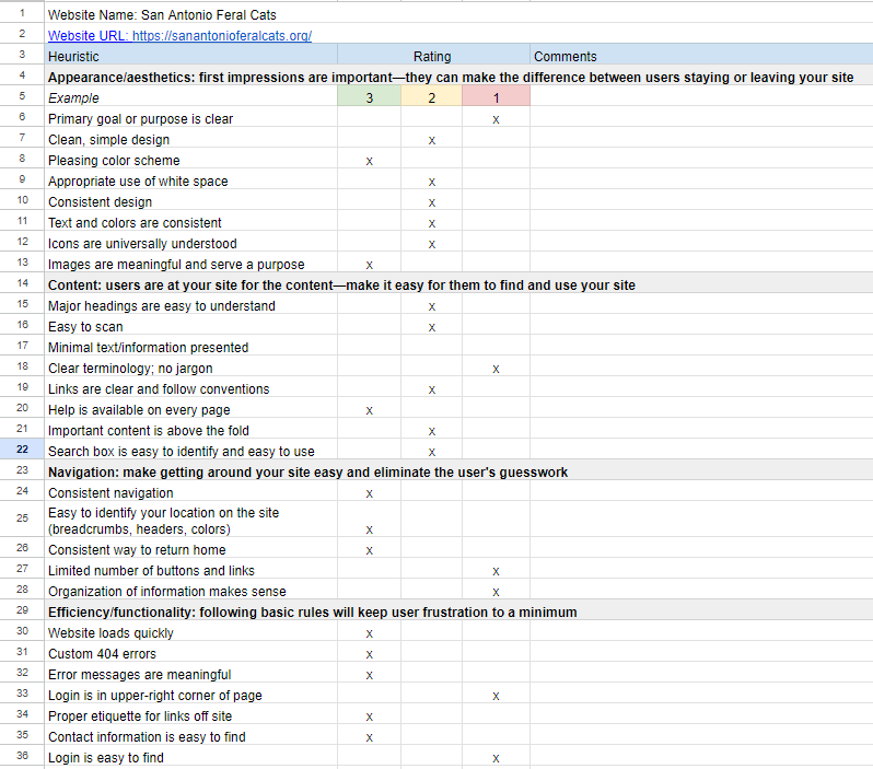
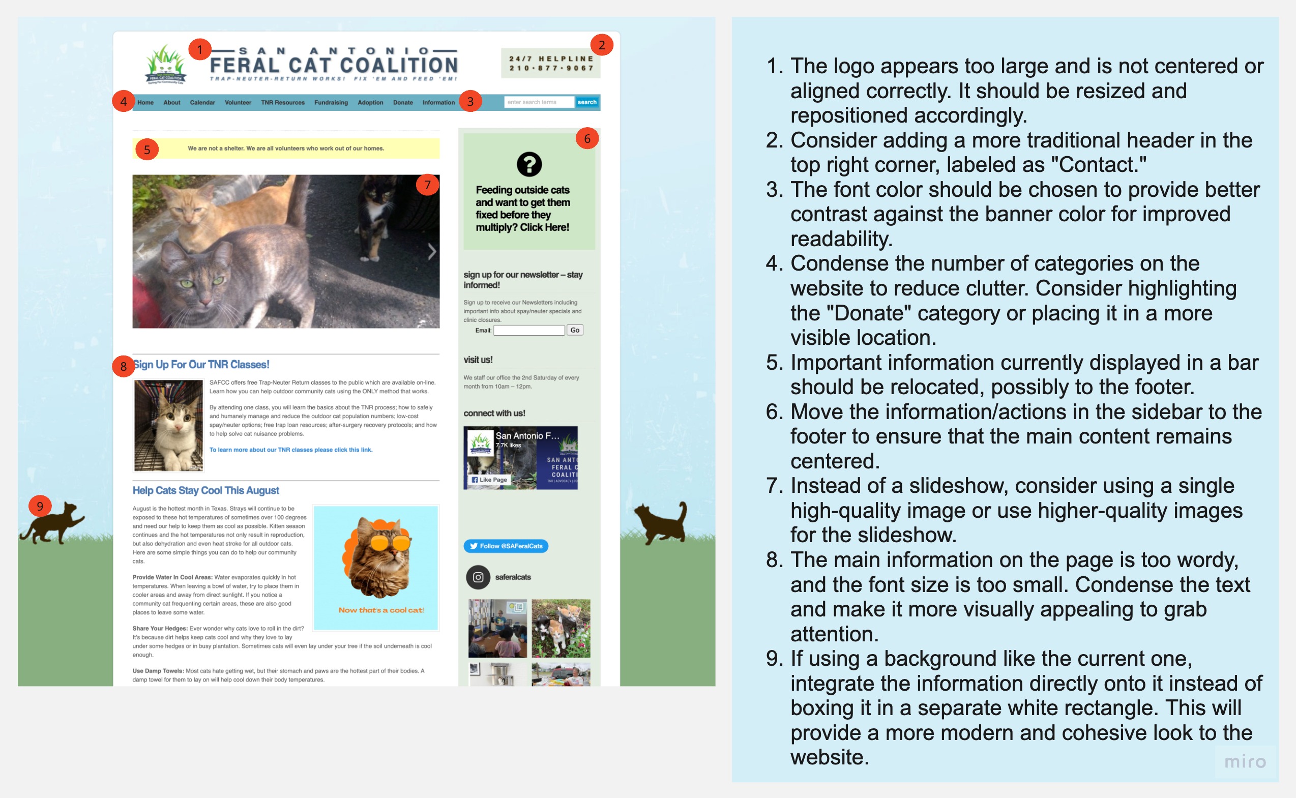
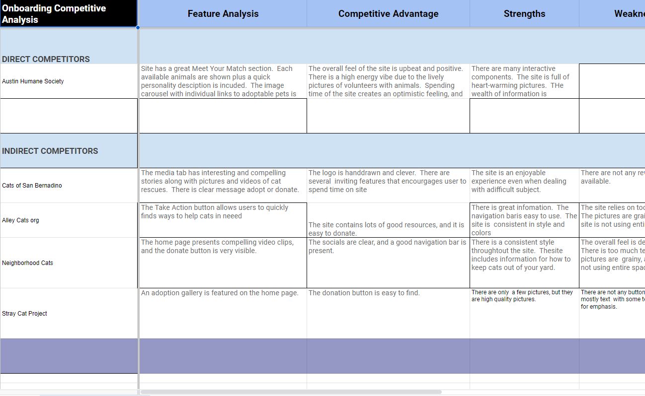
Since the goal of this project was to redesign an existing product, we decided to start the design process with a heuristic evaluation of the website and identified potential areas of improvement. Our observations showed that the colors were mostly accessible, but there was still room for enhancement. After analyzing both direct and indirect competitors, we identified some areas of weakness in their designs that we could address in our own. We noticed that many sites relied too heavily on text, which made them overwhelming and depressing.
Heuristic Evaluation
Competitor Analysis
Objectives
We brainstormed and came up with three objectives that we wanted to answer with our interviews.
Objective 1:
Understand how people decide to volunteer and sign up for the non-profit organization.
Objective 2:
Understand the constraints/pain points people have with the website.
Objective 3:
Understand the daily life of a volunteer and employee of the organization.
Interview Plan
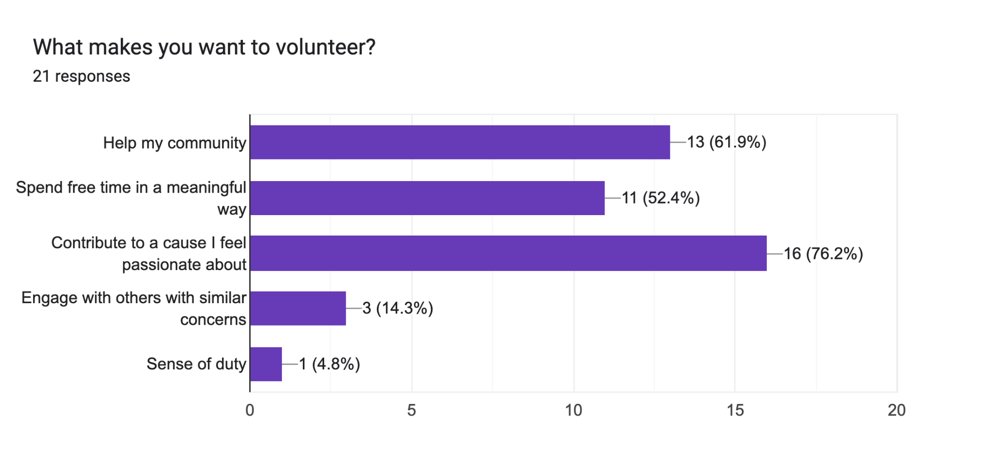
Our research originated with 4 user interviews and 2 stakeholder interviews. Our goal was to discover how we could redesign the San Antonio Feral Cat Coalition website to make it easier to volunteer, adopt, and donate. By establishing a more efficient website, we anticipate helping the overall mission of the organization. Our stakeholders informed us that most of the users were senior citizens and not tech-savvy. From our surveys, we determined that 73 % of participants, ages 18-45, are genuinely interested in contributing to a cause that is important to them, but they are limited by time. After speaking with our stakeholders, we identified that the organization is open to attracting a younger demographic and is wanting better accessibility for the site.
Surveying Potential Users
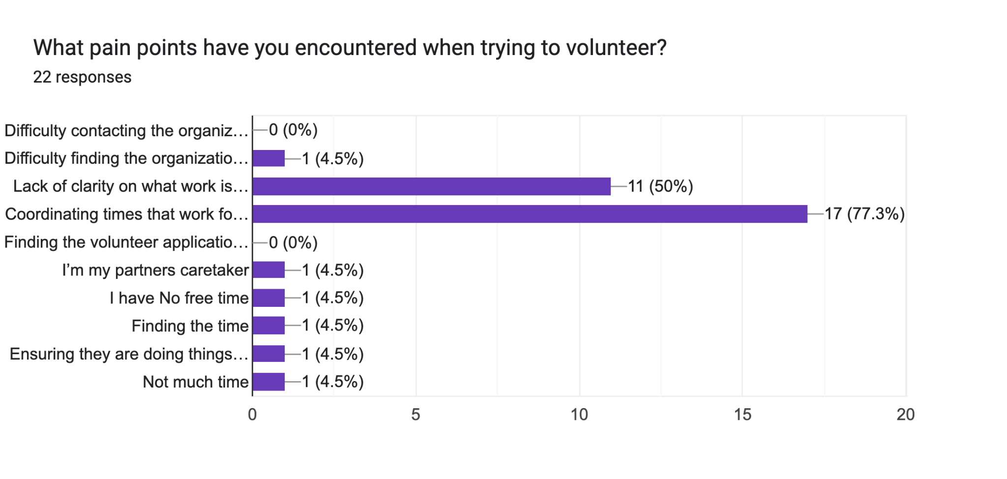
We constructed an online survey to validate our proto persona and guide us in developing an effective redesign of the website. Our questions narrowed in on motivation and pain points.
0%
of people stated they had issues with flexibility with their schedules when trying to volunteer.
Interview Statements
Female
36
Karen
Feels motivated by helping animals
Female
29
Anna
Adopted cat from neighbor who was moving
Female
39
Lauren
Paid for cats to be transported from Asia and adopted in US
Female
38
Stakeholder
Wants to attract younger volunteers to expand the organization
Female
26
Stakeholder
Would like to see a focus on success stories
We compiled our interview research into an affinity diagram and grouped our information into 7 different categories, based on answers with similar themes. This helped us better pinpoint potential users by giving insight into the lives of our interviewees.
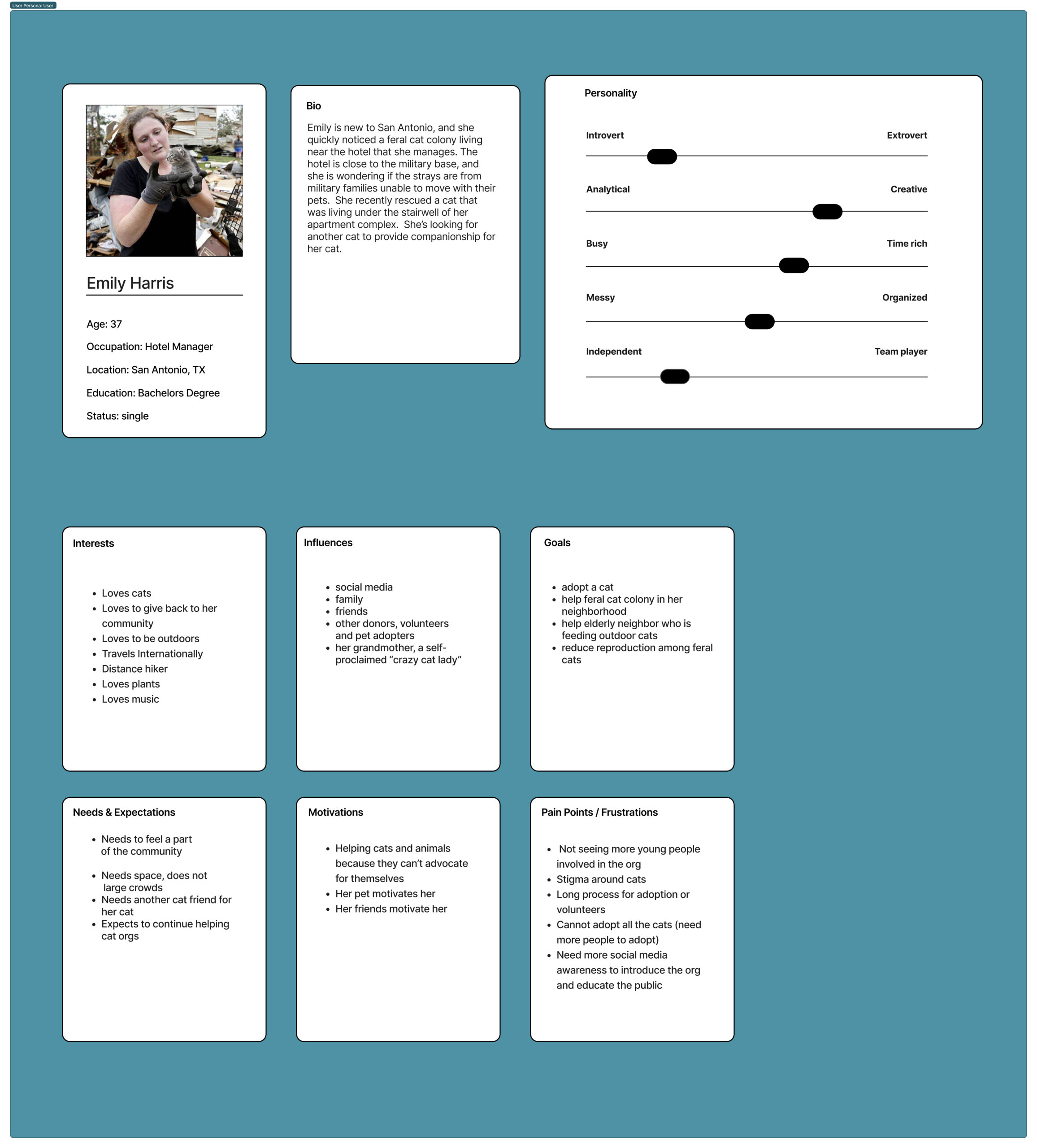
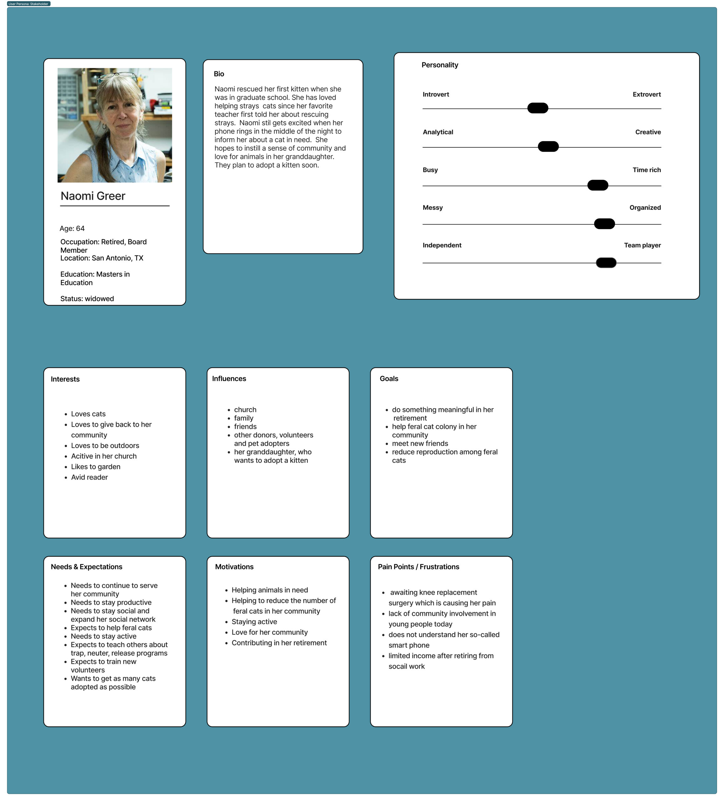
User Personas
After developing personas based on our research findings, we recognized that the user and stakeholder shared similar needs.
Defining the Problem
UX Hypothesis
We believe that helping non-profits like the SAFCC connect with their users in an efficient manner will help save the lives of animals.
Problem Statement
Our product is designed to achieve a simplified community involvement process for volunteers, adopters, donors, and stakeholders. We have observed that there is genuine interest in volunteering, adopting, and donating within a younger and busier demographic that uses technology. How might we improve the product so that our users are successful based on the increased number of rescues, adoptions, volunteers, and donations for SAFCC?
Value Proposition
Our mobile and desktop redesign could relieve user pains by limiting the amount of information, adding better navigation (that included our kitty tinder feature for adoption), and making it easier to donate by adding a button that did not exist.
Ideation
We empathized with potential users and brainstormed design solutions, grouping our ideas into categories and voting on those that we believed would be most important for our users. Our ideas ranged from a simple button to a feature similar to the Tinder app but for cats. This process helped us establish the foundation for building our website’s features
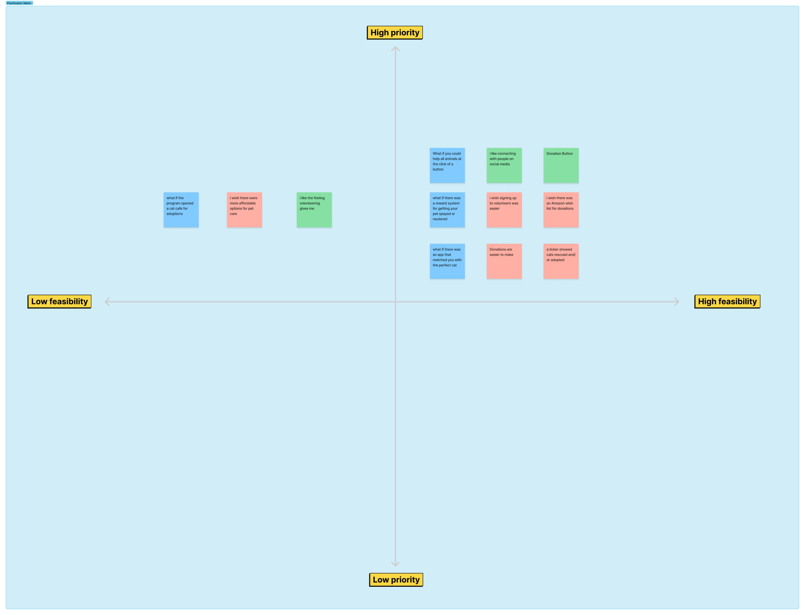
Feature Prioritization
We sorted and prioritized them into a matrix. We felt there were several features we could incorporate into our website that would be easy and impactful to our users. We decided it would be feasible and we would prioritize the donation button, the cat tinder idea and the ticker idea. The adoption ticker was important to our stakeholders and the other 2 features focused on the needs of our users.
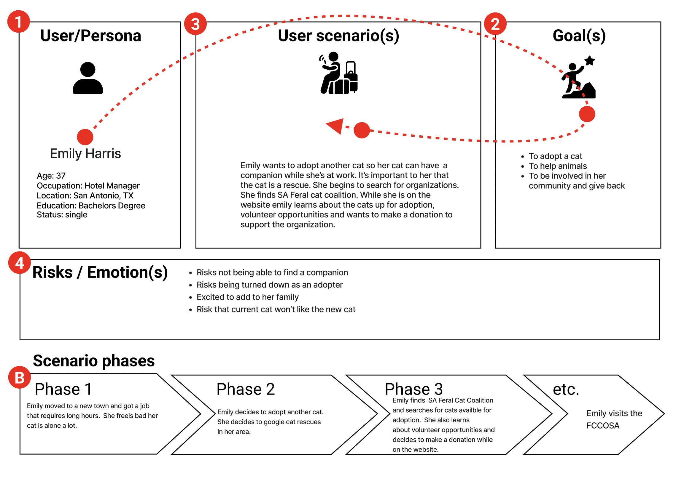
User Scenario
We put ourselves in the place of our user, Emily Harris, whom we chose to focus on for the rest of the project. We created a scenario we thought she would face in the real world. In this scenario Emily is interested in adopting another companion for her furry friend.
Story Board
We expanded and iterated on our scenario to create a story showing how Emily incorporated the website in her daily life. Emily is looking for a second companion and finds the SAFCC where she learns about volunteering and donating while she is looking to adopt.
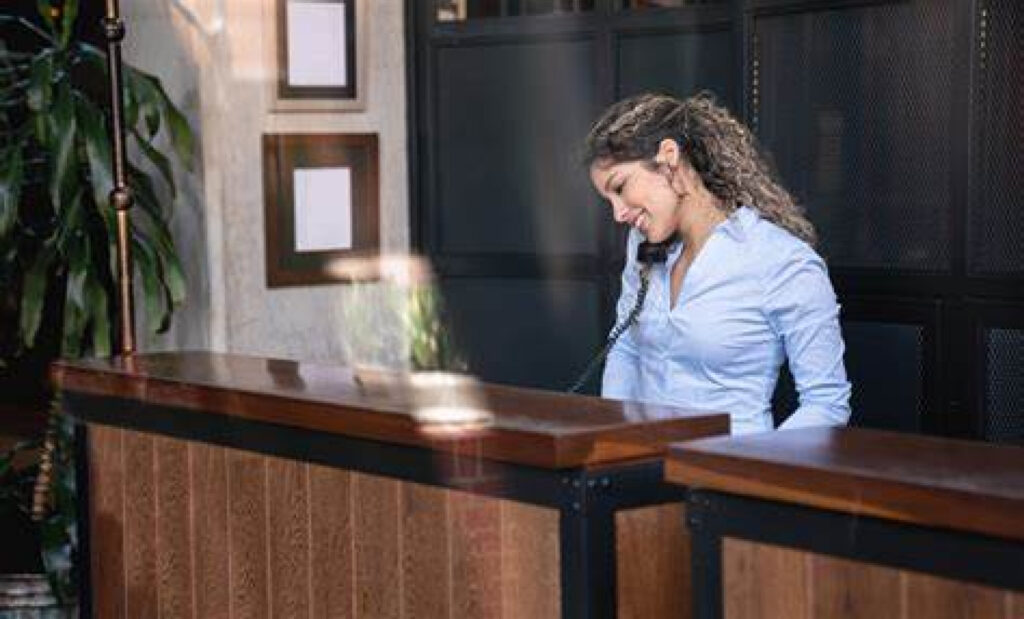
1. Emily is moving to a new town
Emily is moving from Denver to San Antonio. She just got a great opportunity to manage a new hotel.
2. Emily’s first day on the job
Emily is having her first day at her new job. She is excited but worried about leaving her cat, Towanda, at home. She worries she will be sad and bored. Her last job was a little more flexible with pets and was able to bring her cat to work from time to time.
3. Searches for cat rescue organizations
Emily goes on break and is thinking about her cat. She thinks that maybe Towanda would like a companion. She’s excited to start this new adventure.
4. Finds the SA Feral Cat Coalition Website
Emily finds San Antonio Feral Cat Coalition. She is browsing the website to see what they have to offer. She’s happy to see the cat pictures on the website, and decides this might be the organization for her.
5. Emily uses the new feature and donates
On the website Emily learns about the cats up for adoption, volunteer opportunities, and wants to make a donation to support the organization. She makes her donation, and then decides to scroll through the cat tinder feature to see if she would match with a cat.
6. She finds a furry friend
She matches with a cat! She decides to name her cat Antonio. She’s happy she made a new friend.
Journey Map
We imagined Emily’s journey through the website, and considered potential pain points that she may encounter. In this journey, Emily doesn’t know what to do after she has matched with her potential cat. We then identified the pain points and brainstormed opportunities that could become additional features for the website. We included a “See All Cats” button and included a heart button that would take you directly to the adopt application.
Wireframe & Prototype
Card Sorting
After creating our journey map we wanted to make sure our users were able to navigate the website with ease. We sorted the primary and secondary navigation links,reduced the amount of tabs, and created new tabs to simplify the use of the website and made sure we added a donate button to simplify the donation process.
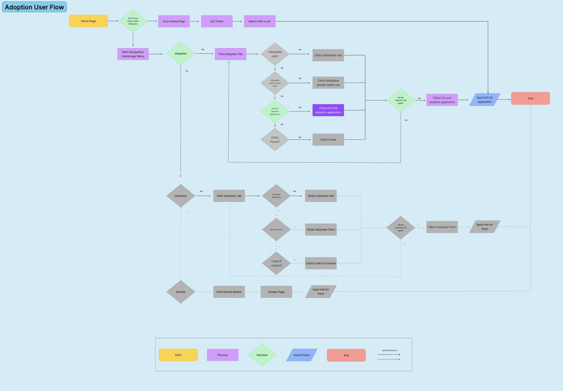
User Flow Chart
In this section we mapped out the exact steps the user would make if they were to adopt, volunteer or donate. The user will follow the steps to interact with the website or mobile site and its key features. The main feature we focused on was adoption and only highlighted the path Emily would take on the website.
Wireframe Progression
We first started with sketch wireframes to show the intended layout of the product’s UI for both website and mobile versions. The key was to keep it simple. Next, we translated these sketches into digital wireframes, which marked the starting point of our design process. We continued to keep the prototypes clean, simple, and organized. We decided it was important to only display the most important information on the main page.
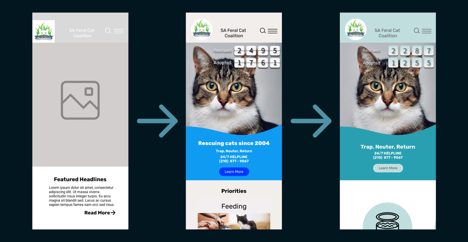
Below is the evolution of our landing section for our mobile prototype. Here you can see one of our key features, the rescued and adopted ticker.
Lo-Fi
Mid-Fi
Hi-Fi
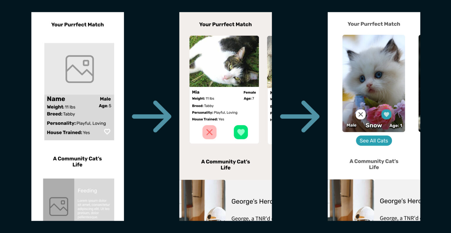
Here, you can see the evolution of our cat tinder feature. Our design has become clean and concise, making affordances more evident.
Lo-Fi
Mid-Fi
Hi-Fi
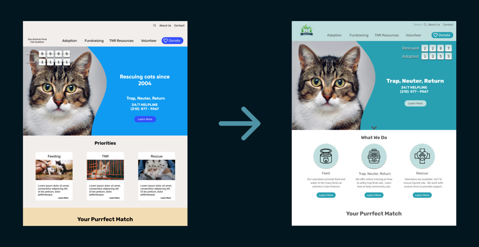
We started testing colors and adding images. Our lo-fi testers decided they wanted different colors. They stated the colors felt a little stark.
Mid-Fi
Hi-Fi
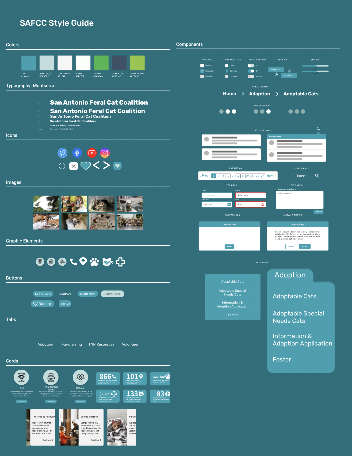
Style Guide
We iterated on our style tile and added a few more components to create our style guide.
Drawing inspiration from various websites, including the original, we decided to maintain a similar color palette. We found that turquoise evoked a youthful, calming, safe, and professional vibe.
Additionally, we included several elements to showcase how they would appear on additional pages of the website. Our objective was to uphold a modern, simple, and professional aesthetic that would resonate with users of all ages.
User Testing
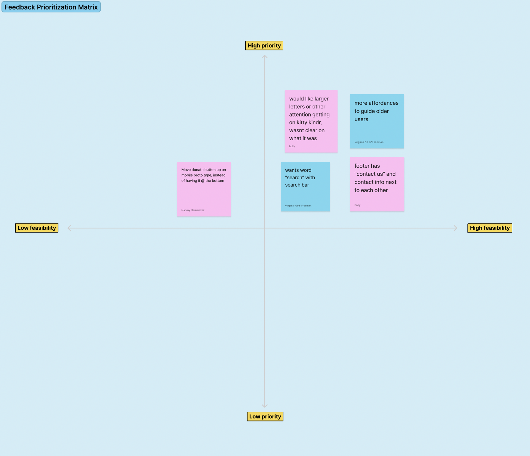
Feedback Prioritization Matrix
We tested the mid and hi fidelity prototypes with users and stakeholders. With limited time, we were only able to make a few iterations. We collected our data, organized and sorted it into a prioritization matrix.
The changes we made:
Larger letters for our kitty tinder feature
More affordances to guide older users
Update the footer
Giving a better indication that you can search in the search bar
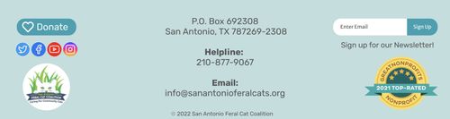
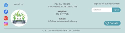
A/B Testing
We received information from our user testing that the users thought the footer needed to be reorganized. We wanted to add our final touches to the website, so we tested 2 different footers. 16 out of 23 user stated that they preferred footer A.
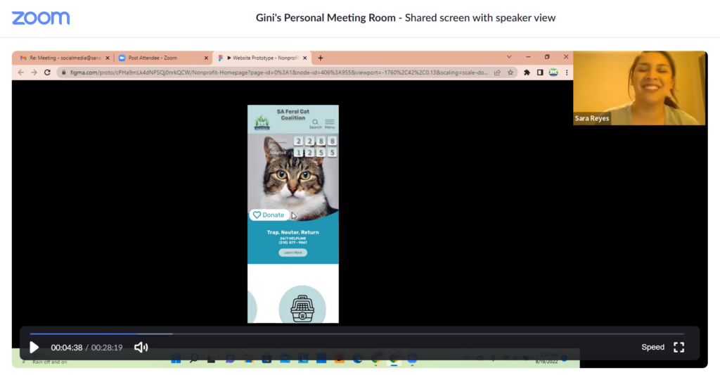
Testing With Stakeholder
Our stakeholders absolutely loved the design! They noticed the great features such as the adoption ticker and the cat tinder. One stakeholder got emotional when she saw how effectively the rescue ticker displayed their impact on the feral cat population.
Prototypes
Please feel free to click around and explore the prototypes below!
Desktop Prototype
Mobile Prototype
Final Thoughts
Several NPO were not interested in participating, and we struggled finding non-profits that would work with us.
It was difficult balancing design principles with the needs of an older user.
It was good practice for the workforce to have to finish the project and provide the organization with our best possible product within the tight time constraint.
Setting aside our personal aesthetic bias in order to cater to the older user demographic was difficult.
We genuinely support the cause, which added to our experience as we felt passionately about helping this organization.
Being in direct communication with the stakeholder was a new experience and added so much substance to our research and allowed us to move forward with a well-informed approach.
We wish we had more time for testing and iterating.